What is the Dyslexia Font: Are There Any Advantages?
Mon Mar 04 2024 • Aliaksei Horbel

Dyslexia is a common learning difficulty that primarily affects the ability to read and spell. It doesn't reflect an individual's intelligence; rather, it's characterized by challenges in the processing of graphic symbols. One innovative approach to assist those with dyslexia is the creation of the Dyslexia font, which is designed to mitigate some of these challenges. This typeface adjusts the shape and weight of letters to minimize their perceived rotation or inversion, which are common issues for individuals with dyslexia. The Dyslexia font, also known as the Dyslexie font, is the brainchild of a dyslexic graphic designer who sought to create a font that enhances readability for dyslexic readers. Features include unique letter shapes that reduce similarity, greater spacing, and varying letter thickness, which all aim to assist with the differentiation of characters that might otherwise be confusing. In recent years, there has been some debate regarding the effectiveness of dyslexia-friendly fonts. For example, a font like OpenDyslexic is freely available and posits similar benefits, with letter-spacing, word-spacing, and customizable font sizes being part of its design strategy. Research and anecdotal evidence provide mixed results, and while some individuals report benefits from using such fonts, studies underscore the need for broad strategies beyond specialized fonts to support dyslexic readers.
Understanding Dyslexia Fonts
Dyslexia fonts are designed to ease reading difficulties for individuals with dyslexia. They incorporate unique features aimed at improving clarity and reducing common reading errors associated with the condition.
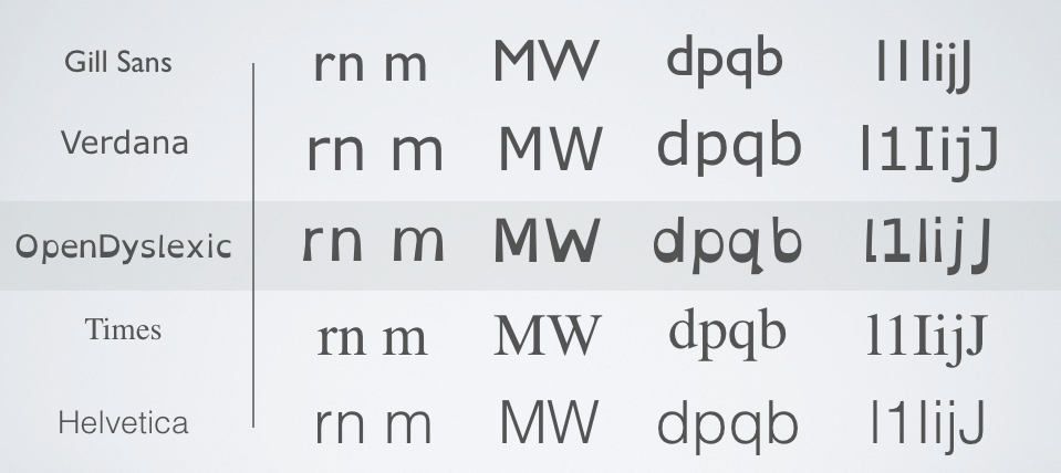
Dyslexia Font compared to the others
History and Development
The concept of dyslexia-friendly fonts emerged from the need to help dyslexic readers distinguish between similar letters. Christian Boer, a designer with dyslexia, developed the Dyslexie typeface as part of a university project to create a more friendly font for people with the condition.
Characteristics of Dyslexia-Friendly Fonts
Dyslexia-friendly fonts typically feature bold, italic, and regular styles with thicker lines. They are often sans serif, with ample letter spacing and unique shapes to prevent confusion between characters. The use of serif or monospace styles is less common due to the potential for visual crowding.
Popular Dyslexia Fonts
Some well-known dyslexia typefaces include Dyslexie, OpenDyslexic, and Sylexiad. These fonts aim to improve reading on both books and pages of websites. Each typeface has its virtues, such as the OpenDyslexic Chrome extension or Dyslexie font products endorsed by organizations like the British Dyslexia Association.
Usage and Accessibility
Dyslexia fonts are widely accessible and used across various mediums including e-books, educational software, and web browsers. They cater to enhancing reading skills, language comprehension, and the overall reading experience for individuals with dyslexia.
Design Considerations and Typography
Designers of dyslexia fonts have to balance typography principles with functionality to address vision challenges. These considerations include optimizing letterforms to improve awareness and lessen the strain of reading.
Academic and User Perspectives
Peer-reviewed research and user feedback have yielded mixed results on the effectiveness of dyslexia fonts. While some dyslexic readers find them helpful, academic studies have not consistently shown improvements in reading speed or comprehension.
Legal and Ethical Aspects
The creation of dyslexia fonts addresses an equity issue in design, considering the needs of those with a disability. The goal is to provide solutions that uphold ethical standards, ensuring information is accessible to all readers.
Implementing Dyslexia Fonts
Implementing dyslexia fonts involves careful selection of typefaces and thoughtful integration into various media to enhance readability for individuals with dyslexia.
Choosing the Right Font
Implementing dyslexia-friendly fonts begins with choosing typefaces designed to enhance legibility. A dyslexia-friendly font typically includes unique features such as distinct letter shapes, weighted bottoms, and increased spacing between characters and words. Fonts like Dyslexie font and OpenDyslexic have been developed with these characteristics in mind. In contrast, widely used typefaces such as Arial, Verdana, and Tahoma offer clarity but may lack the specific attributes of dyslexia-focused fonts.
Incorporating Dyslexia Fonts in Various Media
To make written content accessible, one should incorporate dyslexia-friendly fonts across books, websites, and digital pages. When typesetting, consider not only the choice of the font but also the font size and line spacing. Larger font sizes and adequate spacing can greatly assist readability. Monospaced fonts, as opposed to variable-width fonts like Times New Roman, can also be beneficial as they offer uniformity in letter spacing.
Free and Paid Dyslexia Fonts
Dyslexia fonts are available both as free and paid options, providing a range of choices for implementation. The Dyslexie font and OpenDyslexic are two examples; Dyslexie font is a proprietary option, whereas OpenDyslexic is free to use. Choosing between free and paid fonts often depends on the scope and budget of the project, as well as the specific needs of the intended audience.
Level up your reading with Peech
Boost your productivity and absorb knowledge faster than ever.
Start now